
Colour Your Life


Colour has a huge impact on our emotions, our physical and spiritual well being. Our colour choice in clothes, as well as in our home, define who we are, offering a playful form of self expression. Bold and vivacious, or understated and demure, colour and texture can create an evocative atmosphere that has the power to soothe our mood or uplift our spirits.


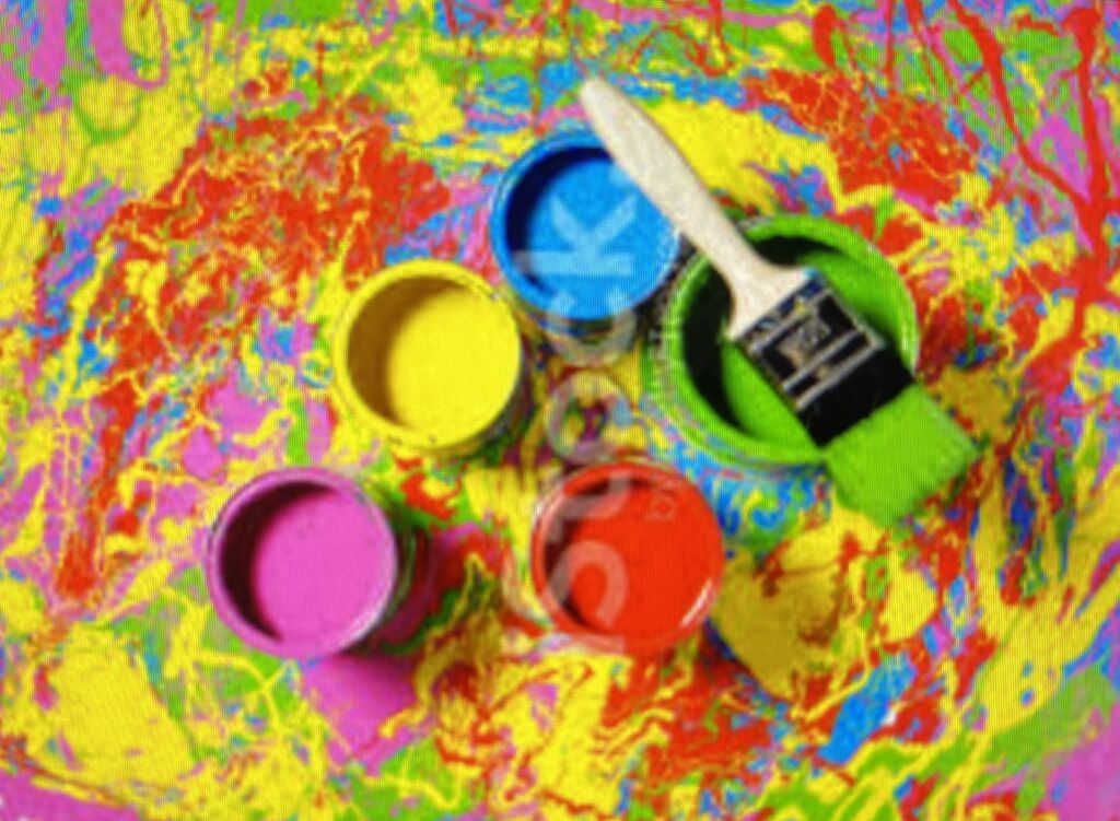
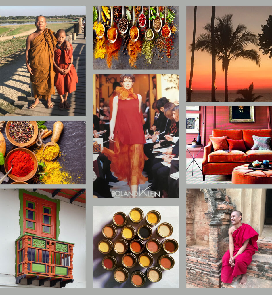
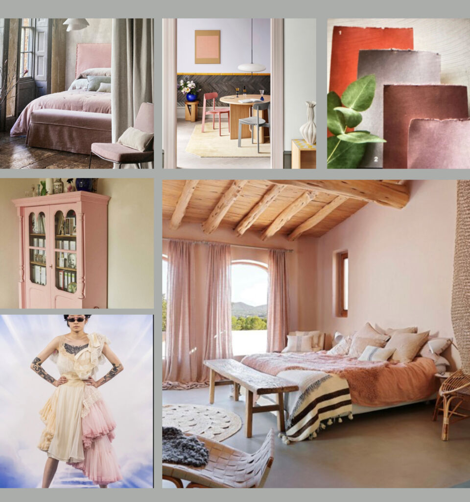
Red, Yellow, Orange, Hot Pink and Mauve, are often frightening colours to use. They are associated with sun-drenched hues, fire, exotic spices … They evoke energy.


Red is the colour of blood and fire. It represents passion, lust, and desire.
It is associated with:
Lipstick
Wine
Tomatoes
Roses
The red carpet
And also:
“ In the Red “
“ Seeing Red
“ Painting the town Red “
“ Red herring “
” Red flag “

Cayenne, Turmeric, Saffron, Cinnamon, Ginger, Paprika …
If you are nervous about these colours, try using small accents first, such as a cushion, a throw or a rug. A splash of strong colour will warm up a room, exude rich opulence and create drama.


YELLOW, the colour of sunshine, symbolises hope, energy and happiness
Think:
“ Yellow ribbons “
“ Mellow Yellow “
“ Les Gilets Jaunes “ have been front page news in France in recent
months (not so happy)
Lemon, Grapefruit, Bananas, Sun Flowers, Daffodils, Mimosa, Lichen, Mustard …


“Green fingers“
“Green pastures“
“The grass is Greener“
“Green Revolution”
“Green room”
“Green with Envy”
“Green Parties”
“Green Card”
“Green Salad”


March 7, 2021 @ 11:17 am
This is a GREAT COLOUR BLOG
of a wonderful assortment of colour that has lighten my day
Congratulations on a great Blog
March 7, 2021 @ 5:31 pm
Wonderful blaze of colour and hope on a grey wintry English day. Many happy memories of your salon and providing me with so many wonderful garments – many of which are still hanging in the wardrobe – and they still fit. xxx
March 7, 2021 @ 8:34 pm
Roland what an absolutely spectacular breathtaking presentation. You have never ceased to amaze me with you endless talent over the last 50 years of knowing one another. It was a honor with great memories of working with you through two decades. Remain well and continue to contribute your talent and share it with all of us. Fondly Casey
March 8, 2021 @ 1:52 am
Absolutely wonderful!! I’ve been wearing wild colors and bringing more color into my home to give myself a lift. It works for others to see this HAPPY statement. Color is a delicious gift!
Thank you!
March 8, 2021 @ 1:55 am
What a brilliant way to prove that there is still a life to be lived and joy to be found… Roland Klein has always been and continues to be a genius. An unerring eye, coupled with a joy for life, once again captures our interest and spurs us on to a be positive for each day of our lives. BRAVO and thank you Roland.
March 8, 2021 @ 9:08 am
Love it!
We indeed need more colors in our life.
March 8, 2021 @ 5:21 pm
Hello
Tout cela est très beau. Ca fait rêver et voyager après une longue journée de travail sur zoom.
Bises
Sylvain
March 9, 2021 @ 8:53 am
Gorgeous colours and inspirational combinations! I love the mustard yellow with turquoise… Thank you for sharing some of your creative wisdom 🙂
March 10, 2021 @ 1:26 am
Roland, what a lovely ‘up’ edition! Colour, rather than the ubiquitous greys, a welcome change. Does it denote that Spring is lifting UK spirits? All the best to you.
March 10, 2021 @ 4:11 pm
What a delight! Great inspirational ideas, looking out on a bleak March day – time to get the colour back into our lives with all this expert guidance
March 11, 2021 @ 6:30 pm
A good post – some great examples of colour.
My favourite being “Different Shades of Green”.
Does that say something about me?
March 12, 2021 @ 2:37 pm
Congratulations Roland. This is a beautiful and inspiring site. You have covered so many aspects of living with colour. Thank you for sharing your superb taste.
March 12, 2021 @ 3:18 pm
Love ‘colour your life’ …….Pantones for the soul ! …really creative and uplifting, thank you June x
March 20, 2021 @ 7:26 pm
Cher Roland
Colours and colour combos to make the heart sing. Really ravishing. Trust you to provide the exact thing we desperately need at this ‘grey’ time. Your blog serves to remind us that there will be Life After Covid where we can all sing and ‘zing’ again!
Lin x
March 21, 2021 @ 5:01 pm
Love it! What an uplifting inspiration in these dull times. Congratulations on a beautiful blog. 🌻
April 30, 2021 @ 8:06 pm
Interesting read thank you! I’m just about to move house so I am doing a lot of thinking about what colours I want and this was inspiring!
October 31, 2021 @ 11:40 am
Quelle belle leçon de vie avec « Color your Life » et un ravissement.
Notre ami Roland est une source d’inspiration.
Tous les tableaux sont beaux et créatifs. A nous de jouer avec les couleurs…
Grosses bises
October 31, 2021 @ 9:02 pm
Amazing n very colourful 😘